This article is adapted from a flash talk I gave at General Assembly in October 2017, and the images have been pulled straight from the presentation deck. Enjoy.
You may have heard about digital brutalism. It’s so hot right now. Let’s have a look at what it is, and why you should care about it.
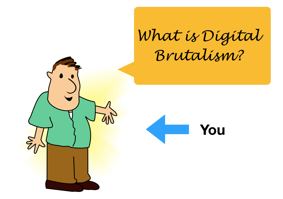
I can hear you asking: what is digital brutalism?
Woah there, cowboy! To answer this, we must first ask another question:
‘What is brutalism?’
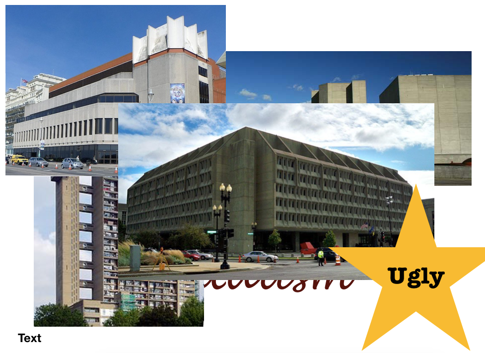
We’ve all been there: you’re walking through a picturesque town, having a great day, and then you’re metaphorically punched in the face when you see something like this:
Depending on your artistic leanings, you either gasp with joy or vomit a little in your mouth and move on.
Brutalism was an architectural movement from the 1950s all the way through to the 1980s which had a strong focus on raw, unpolished aesthetics. According to the good people at Wikipedia, it was seen as a reaction by a younger generation to the lightness, optimism, and frivolity of 1930s and 1940s architecture. Unlike that architecture, it had a lack of concern to look comfortable or easy.
Got it. But what is digital brutalism?
Although we lack a fully agreed upon definition, digital brutalism is very much the same: a style of digital design that lacks concern for looking — or being — comfortable or easy. It has been described as ‘an antidote to the softer web’. It has a focus on rudimentary layouts, minimalistic designs, basic typefaces and just simply ‘throwing things together’.
Importantly, it harks back to the early days of the web, when there was less design standardisation and less ability to make things nice or user friendly. More on this later.
Examples, please
Sure.
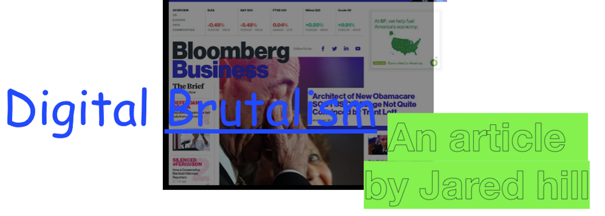
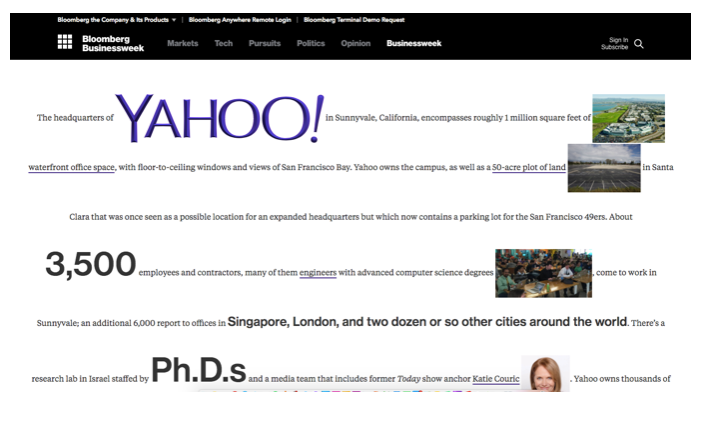
Bloomberg.
One of the most well-known brutalist pioneers, Bloomberg are awesome — check out this article for some sweet sweet design.
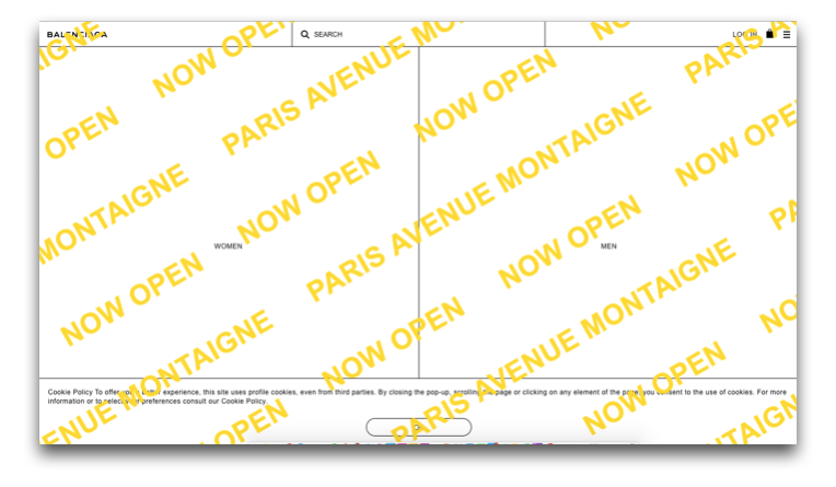
Balenciaga.
One of my personal favourites, Balenciaga simply does not give a shit.
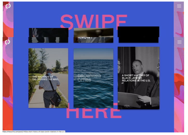
The Outline.
New-ish publication The Outline embraces brutalism as part of its core identity, and strikes a good balance between usability and bad-ass aesthetics.
Loads of others.
There are lots out there, and BrutalistWebsites.com does a good job of compiling them. The sheer range of different designs shows just how hard it is to put a singular definition on ‘brutalism’. It’s many things to many people.
So why should I care?
Unlike its well-researched big brother, architectural brutalism, there isn’t yet a huge amount scholarly thought on digital brutalism. Poor little guy doesn’t even have its own Wikipedia page!
So why do people seem to like it? Does it have any place in modern digital design? Is this just a bunch of people with too much free time?
Well, I’m here to convince you it does have its place. I’ve put together five reasons why it may appeal, from a design perspective.
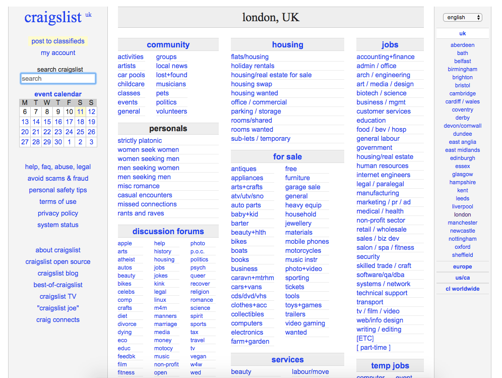
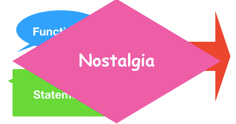
1. It can be functional
Look at Craigslist, a site which hasn’t really updated its design since it began, and which continues to be used by millions today. It may not be beautiful, but it works, its users consistently succeed in doing what they come onto the site to do, and they’re comfortable with its quirks.
Furthermore, the out-of-date design may even contribute a little to its success: the ‘thrown together’ nature of the site perfectly matches the hasty ‘bargain sale’ quality of the site itself.
They even have a ‘casual encounters’ category which I assume is for meeting new friends for coffee.
2. It can be a statement
Like architectural brutalism, digital brutalism is a way to push back against conventions by a younger generation, and can be a statement about UX best practices. When researching this article, I found that this was the single biggest explanation given for the its appeal. Even BrutalistWebsites.com says that it:
…can be seen as a reaction by a younger generation to the lightness, optimism, and frivolity of today’s web design.
However, I disagree that this is the primary reason for its appeal.
3. It can create standout
In the digital world, standing out is increasingly difficult, especially with more and more established design systems such as Material Design. In the same way one might construct a weird building to attract attention against a uniform cityscape, so too can designing a brutalist website pull the user in and pique their interest.
4. It can increase engagement
We know that discovery can increase engagement, especially amongst certain user groups. However, it’s incredibly easy to find all the cool features on a website nowadays, and maybe, just maybe, this actually leaves us feeling less engaged than if we had to work for these features.
Emphasising discovery on your website might still allow for large numbers of superficially engaged people, whilst also rewarding hardcore users who have spent time figuring things out and getting invested. Look at Snapchat, a company well-known for hiding features and using relatively few signifiers in their app.
I feel that this effect is related to the good old days of the web, when logging on to the world wide web made you feel like an explorer, uncovering interesting sites and digging up random features.
This brings me to what is, for me, the most important reason why brutalism appeals to so many people, and one that is slightly overlooked in a lot of the discussion surrounding it.
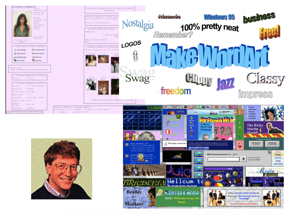
5. It’s really bloody nostalgic
My generation, that much loved (read: loathed) ‘millennial’ generation, spent our childhoods in the wild wild west of the internet. Hastily thrown together pages, bad UX, unintuitive controls, confusing workarounds. Websites broke as a rule, not an exception.
We are the generation of crappy gifs, customisable MySpace pages, Microsoft Paint, WordArt, and Geocities.
The internet was our playground, and whilst it wasn’t a perfect playground, it was all that we had. We often forget that the internet is not just a utility, it’s a world of its own, and lots of us spent hours and hours of our childhoods lost in that world. This digital world has changed so much over our lives, like a small town becoming a big, bustling, futuristic city in front of eyes. Is it crazy to think that we would yearn for some of that brutal, basic ruggedness that we were once so accustomed to?
But what about UX?
From a UX perspective, where does this sit? Surely we can’t permit the bastardisation of the web just because it makes us feel nice feelings?
I agree. Brutalist websites are (for the most part) a novelty. I don’t advocate for brutalism to take over the web, and would be sad if it did, as it would undo the years of hard work that designers and developers have put in making the web the usable, accessible place it is today.
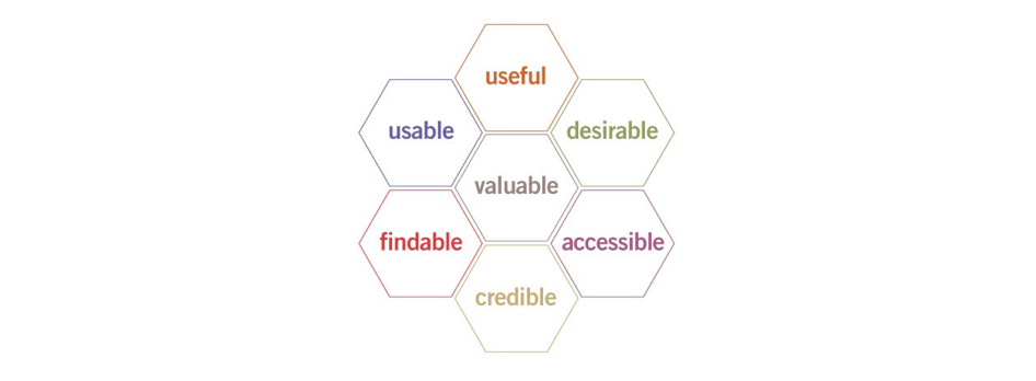
But it does beg the question: if a brutalist website could fulfil all the pieces of the UX Honeycomb, whilst still retaining its rough, brutalist aesthetic (like websites such as Bloomberg try to do) — then could it become a legitimate digital design aesthetic? Or does it then, by definition, cease to be brutalist?
Honey, yum.
Soppy conclusion
For me, there’ll always be something endlessly comforting in a really badly coded webpage, full of gifs, pixelated images and mismatched fonts. One brutalist website creator said he liked brutalism because he missed the ‘labyrinth of experience’ that the old web represented. I couldn’t have said it better myself.
Is Brutalism good or bad for the internet? Maybe that’s not the question we should be asking. How does brutalism make you feel? It makes me, and a lot of other people, feel good. And maybe that’s enough reason to say that brutalism still has its place in today’s digital world.
Interested in more? Here some more cool articles that expand on the trend: