Making Shitty Vegan less shitty: a personal skills test
23 June 2021-
“Am I improving as a designer?”
It’s a question that most of us ask ourselves from time to time. A single visit to Design Twitter, filled with its hustlers and lifelong learners, is enough to leave anyone with the crushing feeling of not doing enough to keep up.
So, I thought I’d set myself a challenge. I’d revisit an old design and critique it, seeing if there are things that Current Jared would do differently to Past Jared.
And I’ll be honest, this exercise scares me a lot. What if I find I can’t improve on my old designs? There’s always been that lingering thought in the back of my mind that says that despite all the effort, perhaps I’m just not getting better at design. Or worse, perhaps my years spent in consulting have rotted my brain and turned me into a terrible designer?
I guess all I can really do is find out.
An introduction to Shitty Vegan
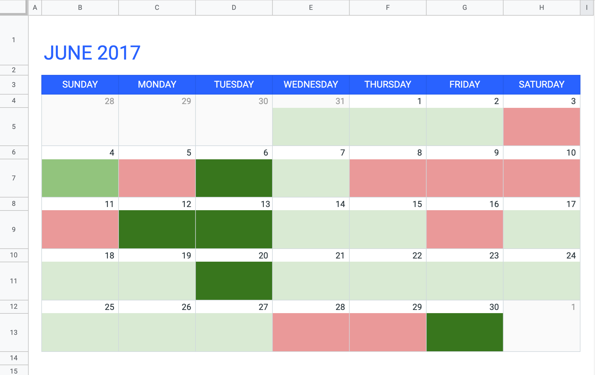
Shitty Vegan was (and still is) a fun little idea for a diet tracking app that I created as a passion project in 2017. Back then, I was going through a transition to veganism and had created a spreadsheet on which I tracked day-to-day whether I’d eaten vegan, or whether I’d screwed up, and by how much:
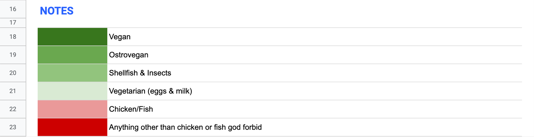
Each coloured square would represent how ‘vegan’ I had eaten that day, with the non-vegan foods put on an arbitrary sliding scale of ‘ethicalness’, from almost there (like eating a mussel or insect) to wayyyy off (like eating red meat):
My foolproof rating system.
I liked that it motivated me to try connect up the green squares (pretty much the basis of the ‘Don’t Break the Chain’ productivity approach) and that I could look back on the month and get a general sense for how good I’d been. I also liked the fact that it promoted a different method of going vegan than the ‘cold turkey’ approach, where people go from eating meat to completely vegan one day to the next. I’d noticed that friends who tried this were successful for while, but then would have one bad day and give up, going straight back to old habits.
I believed (and still believe) that veganism shouldn’t be a strive for perfection, or a competition of who can be the most ‘ethical’. One shouldn’t feel bad for making mistakes and cheating every now and then. So you screwed up and drunk some milk? That’s fine, try again tomorrow. Perfect should never be the enemy of good. However, we should all be striving to do better every day. And even if you manage to eat vegan for just one day, it should be celebrated.
So, I thought, why not turn this idea into an app that everyone can use?
Revisiting my objectives
Before jumping into the redesign, it’s important that I revisit the original objectives of the product. It wouldn’t be fair to Past Jared to design something ‘better’ if I’m not taking into account what the poor chap was trying to achieve in the first place.
This is actually a chance to raise a quick point on design criticism. Contextless design criticism is very easy, and very pointless. Design is an extremely soft science with an oh-so-creamy centre, and there’s very rarely any way to empirically prove that my design is better than _yours _(yes, even with user testing). I’ve seen many people — especially designers — take advantage of this fact by throwing criticisms at a design without any context, making themselves look like some sort of design deity. The fact is that apart from basic heuristic analysis, criticising designs without knowing the decision process behind an interface (the objectives, explorations, discussions, tests, and trade-offs) is largely futile.
So, what informed my decisions in creating Shitty Vegan?
My objectives were:
To make an app that helps people track their gradual transition to a vegan lifestyle without feeling pressure or being discouraged by slip-ups.
Create a super-simple MVP that wouldn’t be too hard to develop but would test the assumptions.
Make something that I would actually enjoy using (because what’s the point of a passion project if you don’t like it?)
Delving into the designs
Time to have a look at what I had come up with.
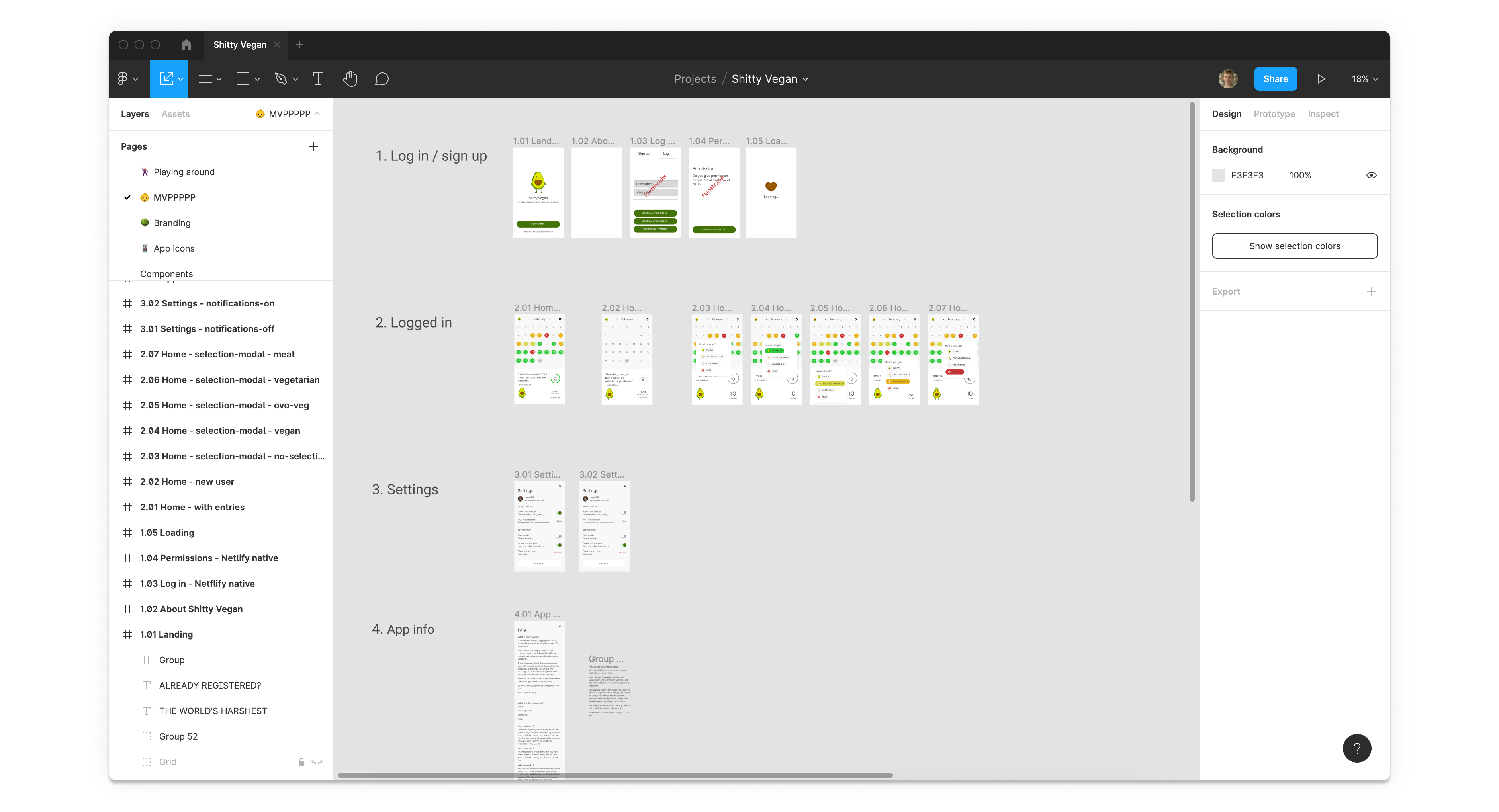
The Shitty Vegan Figma file.
First of all, well done Jared, it’s a surprisingly well ordered file! The flows and screens are named and numbered, and all the various states and edge cases are designed. I can be pretty lazy with file organisation on personal projects, but at the time I was working with my developer friend Oli to turn the concept into a PWA, so I was more focussed on making the file easily navigable for newcomers. Great start.
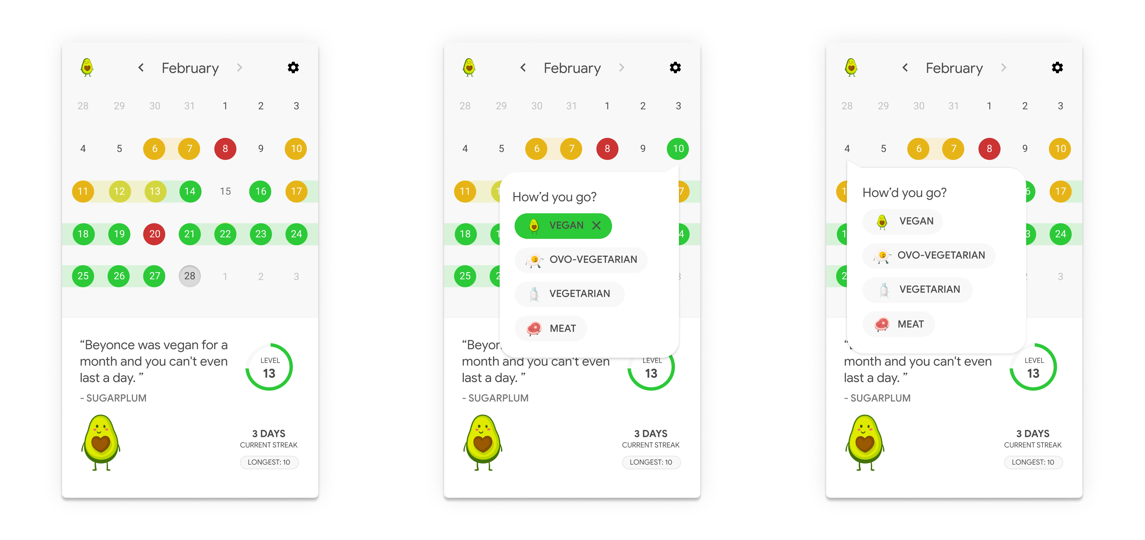
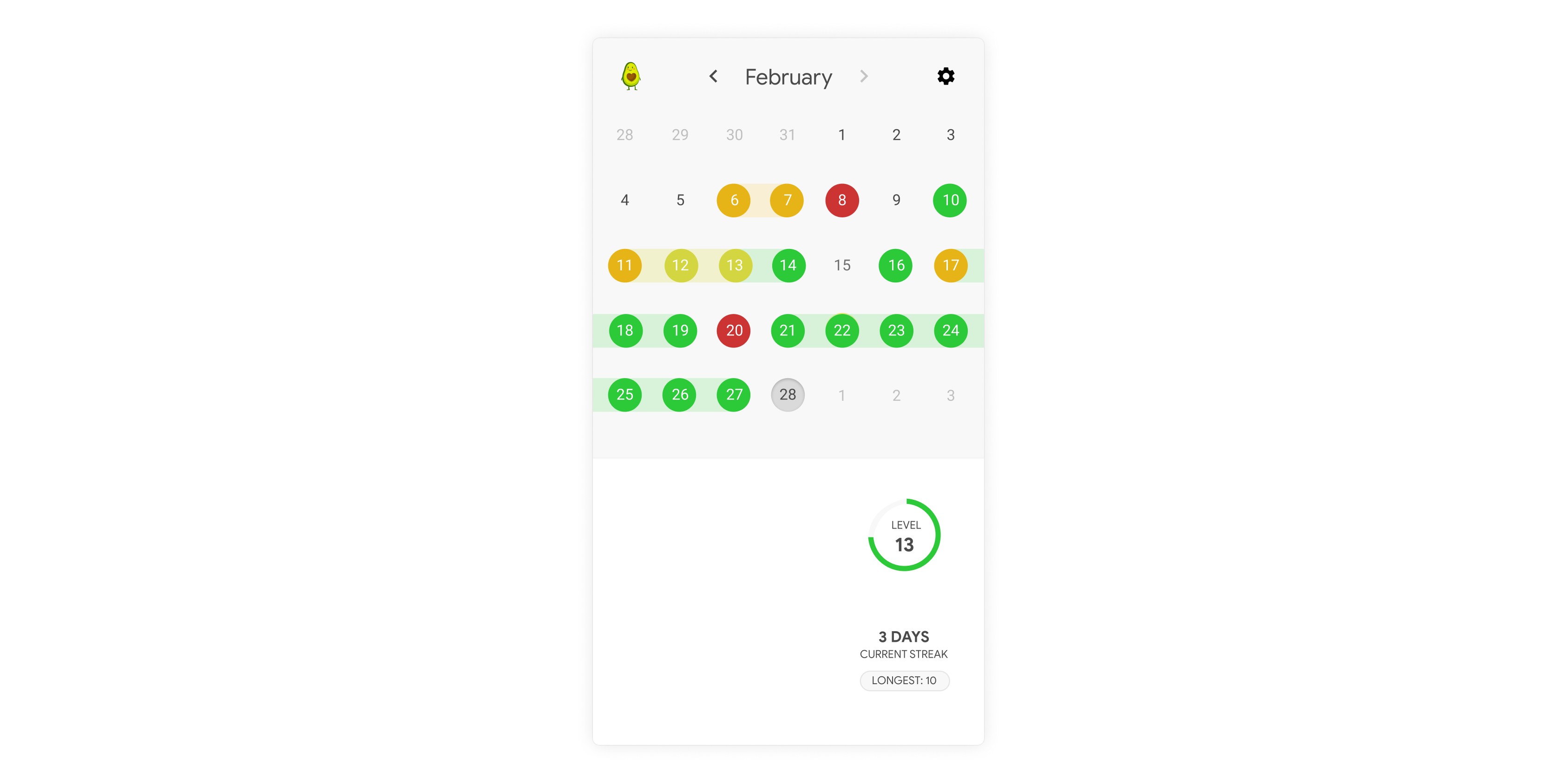
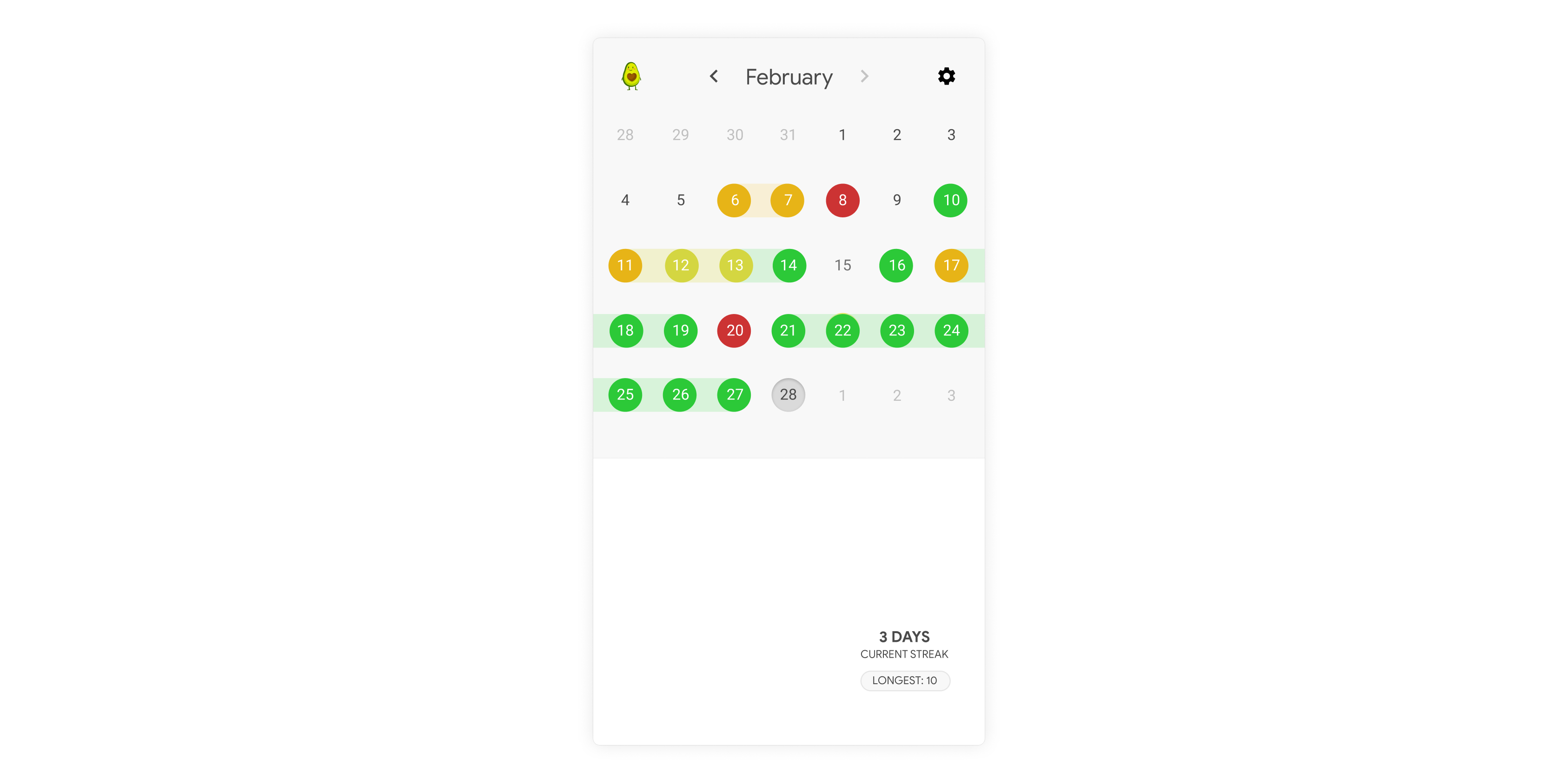
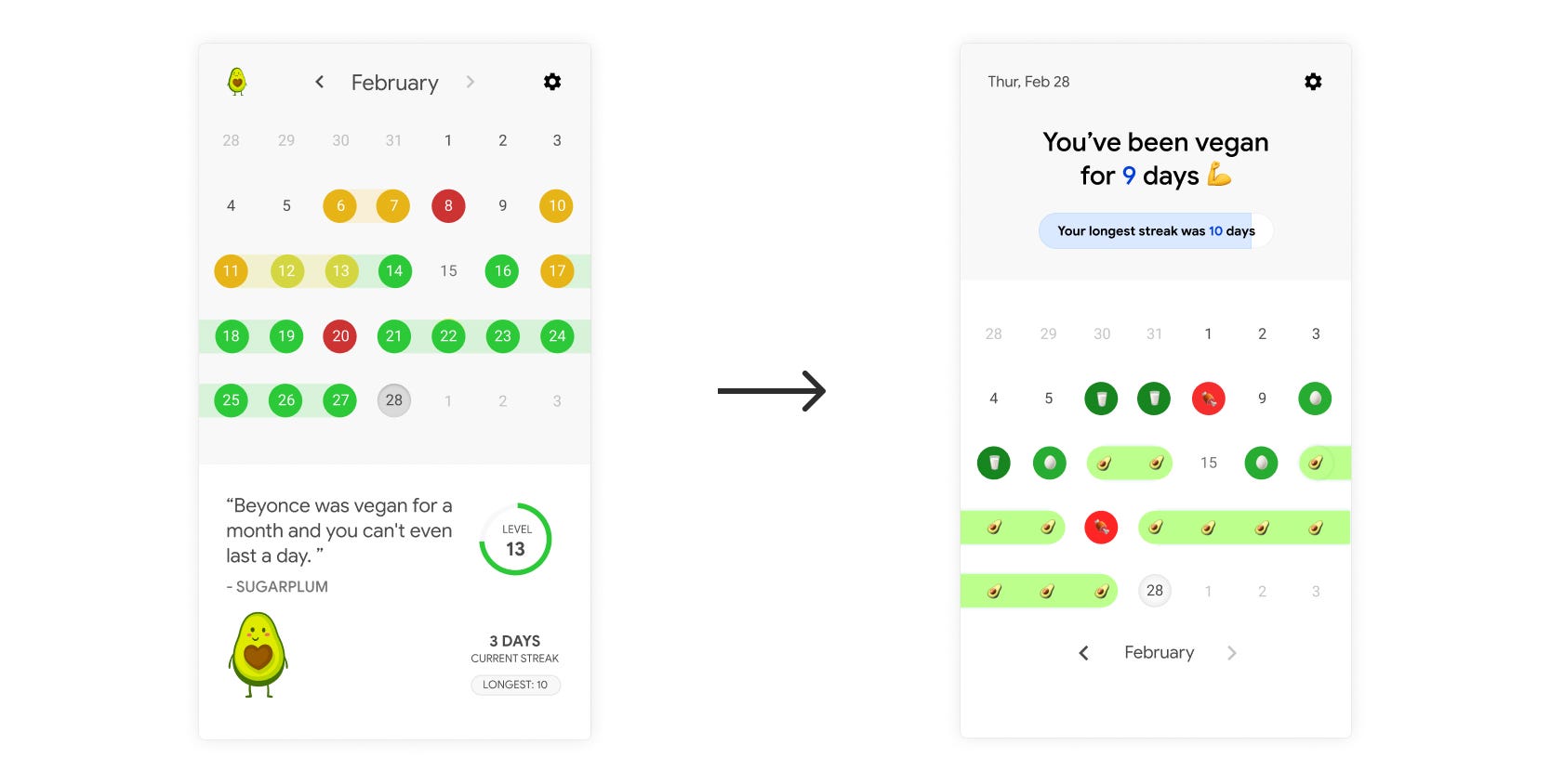
Let’s have a look at the main screen. The top section consists of a calendar, just like my original spreadsheet, but I also added some ‘connectors’ which indicated the strings of days on which I had done as good or better than the day before. Whilst eating vegan was the ideal, I wanted to encourage users for any improvements they made day-by-day.
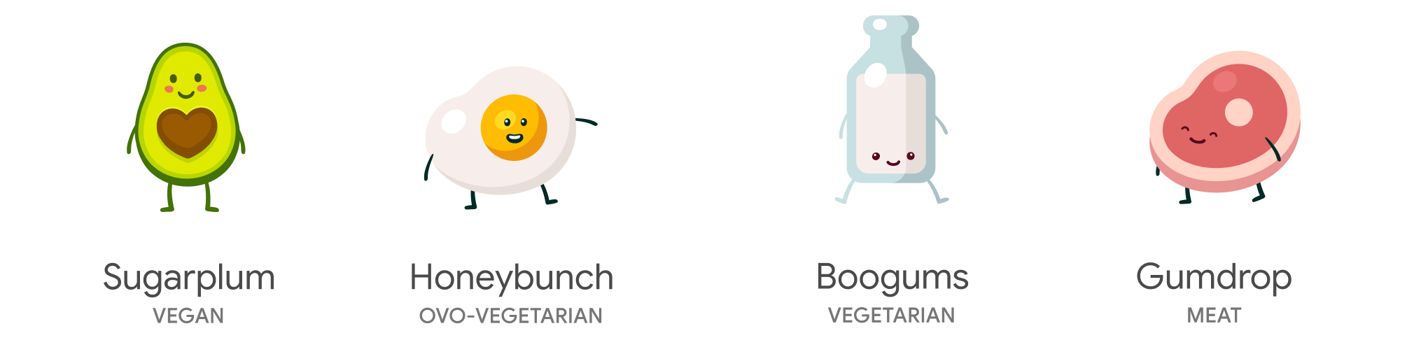
The bottom section contains some added value elements, which I’d put in there to make the app more ‘sticky’. The first of these was the use of four little characters who would each represent one of the dietary categories:
The idea was that these mascots would make fun of the user based on the their eating habits, making snarky/playful/funny comments every day when the user logged their diet. The tongue-in-cheek comments would be highly critical regardless of whether the user had been doing really well or really badly, which I hoped would make the entire process more silly and lighthearted.
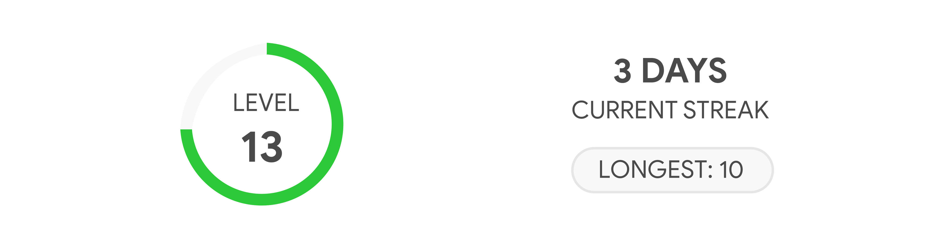
Finally, to the right, I added some data that I hoped would gamify the process a little bit:
A level which would improve the more the person used the app (I don’t really remember how this was supposed to work, and I’m not sure I even knew at the time)
A streak tracker to show how many days in a row they had been vegan
Critique
The good
So, what are my initial thoughts? I remember working really hard to get the app down to its bare basics, and the designs show that. At first glance, it certainly seems simple. There’s very few features, and the visual design is minimalist enough that there’s not many glaring errors. The combination of the stripped back colours and straightforward typeface means that the interface hasn’t actually aged too badly at all. It strikes me how little fundamental visual design trends have changed in the last four years, versus, say, the four years before that.
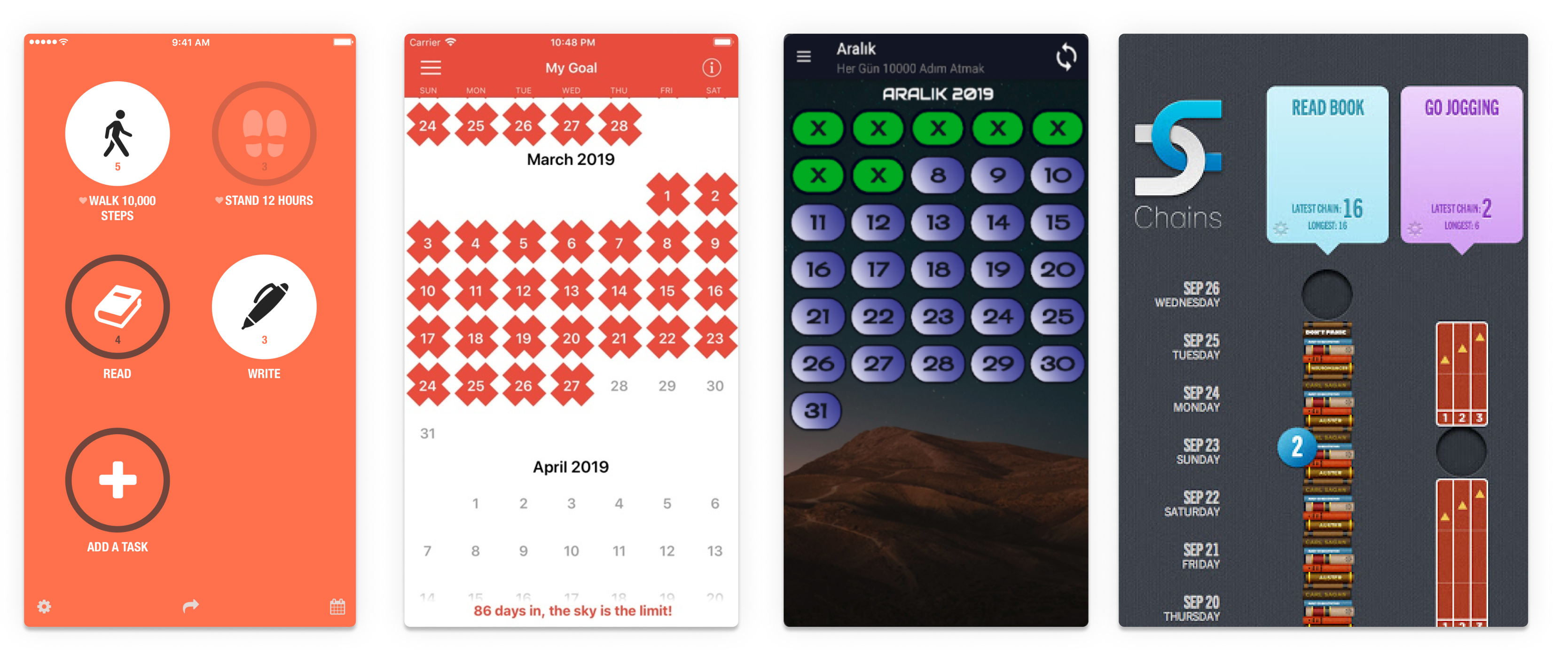
The decision to not overly decorate was made because the calendar was already quite visually busy and so adding more visual information would potentially dilute its meaning. Looking at apps that try to do the same thing makes me feel better about this decision:
Screenshots from similar apps. Very happy to let others experiment with colour.
So, how does one improve on something so minimalistic?
The bad (and the ugly)
Well, fortunately, simplicity is not simply a matter of reducing features or making something look visually clean. The perceived simplicity of an experience also has to do with the complexity of the information being communicated, and the steepness of the learning curve required for a user to understand that information. As John Maeda said in The Laws of Simplicity:
The best designers marry function with form to create intuitive experiences that users understand immediately.
In this case, I think that a lack of discipline on my part meant that, whilst I was able to create an interface that was visually clean, conceptually this thing is all over the place. The interface screams at me that the designer doesn’t exactly know what they want to create or which element will deliver true value to the user, leading them to just throw together a bunch of incongruent features. The result is a non-committal experience that lacks hierarchy and focus.
On the one hand, the app wants to be a diet tracking calendar, which visually depicts the eating habits of the user over time. This is a very different solution to the use of cute cartoon characters to scold you for your diet, which again is different to the gamification of diet tracking using statistics and data.
The question that needs to be asked is: Which of these ideas is going to deliver true value to users? The truth is that I didn’t know the answer to this question when designing it, and the interface suffered as a result. The visual hierarchy is incredibly non-committal, and offers a pastiche of features that communicates both a lot and *very little *to first time users.
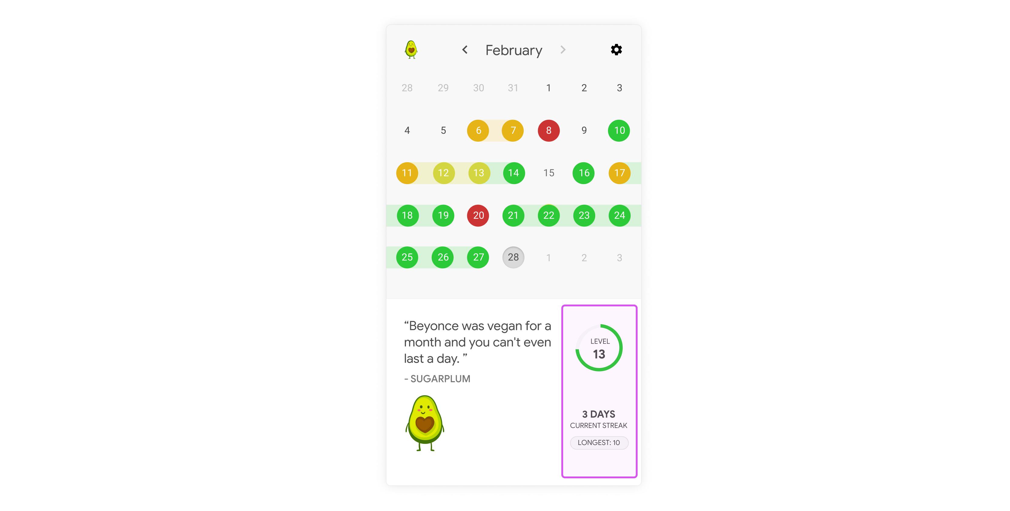
Take, for example, the streak and level data:
From a visual point of view, it neither stands out nor is hidden. It feels like an ‘afterthought’… which is exactly what it was. If I put myself in the shoes of a user, I would be asking myself: What is a level? What is a streak? Do I care? The interface is telling me that I really shouldn’t care.
Sorry, Past Jared, but it’s time to dismantle your designs.
Redesigning the interface
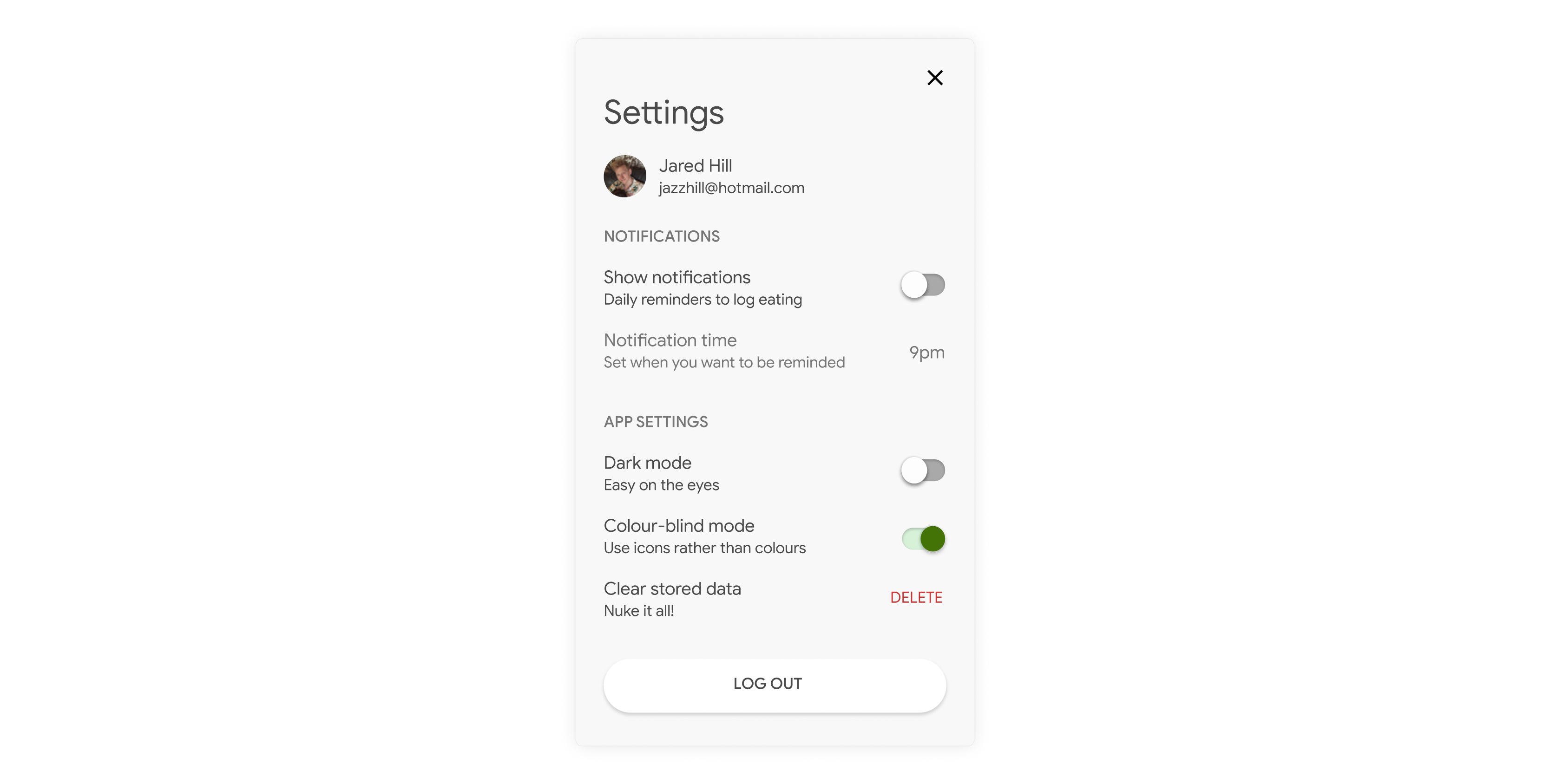
Part of being a good designer is learning to be tough with your designs, even when you really don’t want to be. I decidedly failed to do this on Shitty Vegan. To prove it, just look at the Settings page:
Dark mode and colourblind mode, Jared? You’ve got to be kidding!
So, with the benefit of time and hindsight, let’s see what happens if I’m a little more tough with the myself. I’ll apply the use it or lose it rule and hopefully answer the question: ‘What is the core of this experience?’
The cute little characters
I designed the mascots out of a fear that the base functionality of the app didn’t have enough ‘delight’. However, I was never satisfied with the solution I’d created, and deep down, knew that being berated by cute character was mainly decoration: it didn’t really help achieve the user goals. However, it stayed because I didn’t have enough faith in the other features.
Realising that people don’t use apps because of how they’re decorated is key to building products that people want. Designers love to focus on beauty and delight, and whilst these things are important, very few people use products purely for these elements. People tend to use digital products that they think will solve their problems and add value to their lives, and if you feel (as I did) that you have to add extra elements to convince them to use it, your core proposition might be broken.
Sugarplum, Honeybunch, Boogums, and Gumdrop, my dear babies… as much as I love you, you really don’t add any actual value to the experience. Worse than that, your existence could overshadow other features. If this app is going to be useful, it needs to be useful based on the initial assumptions, which you have very little to do with. So unfortunately, you gotta go.
Sorry, lose it.
Next, the stats. I can’t even remember how I planned to implement the level data, and I think I only put it in there because I wanted to encourage users whenever they used the app, regardless of how well they were doing from a dietary perspective. Its purpose and rules are obscured to users (and to the designer too!), so I doubt it would really encourage anyone to do anything.
Alas, lose it.
Next, the streak data. This element actually supports the core concept of the app really well — after all, streaks are also depicted on the calendar — and therefore their presence could actually help test the core assumption that I’m making with the calendar. The longest streak is especially great data: it helps give the user something to aim for even after using the app for a long time (which is what I was trying to achieve with the level data).
A very firm use it.
But why cram this feature all the way down the bottom? If we’re gonna use it, let’s tell the user how important it is. The calendar being at the top reduces the importance of everything below it, and I only put it there in the first place because it was the core of the original idea. I think I may have missed a trick here.
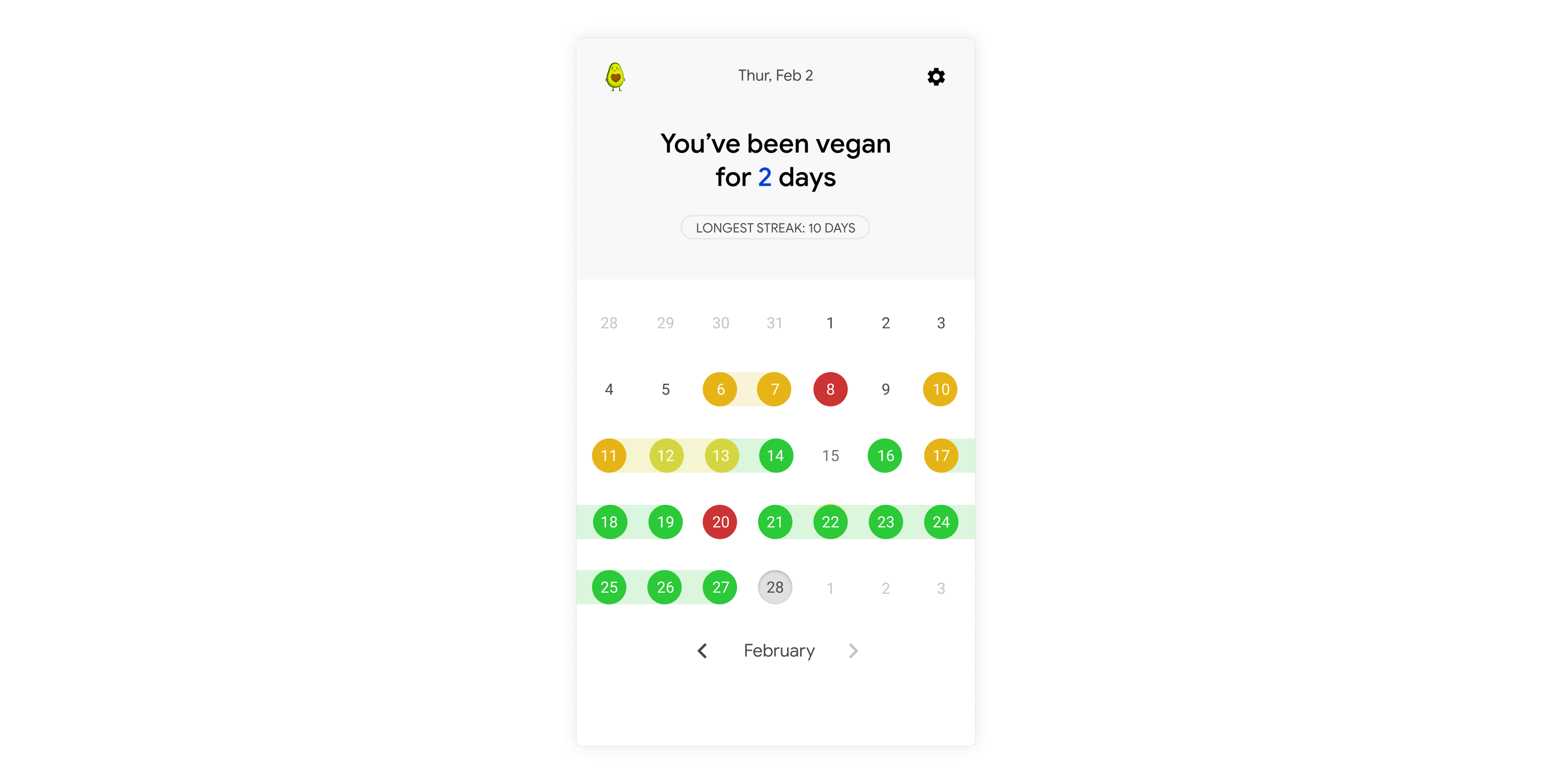
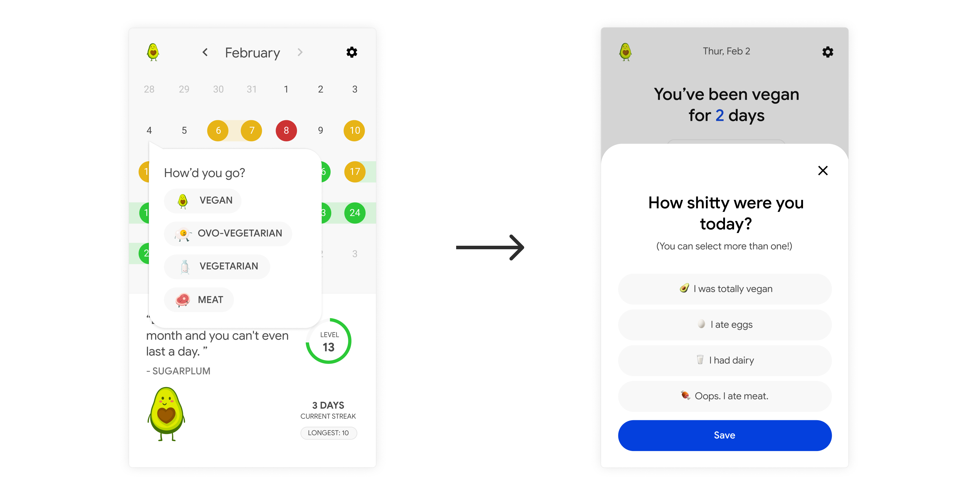
Let’s flip the elements and then add a lot more emphasis on the streak tracking. Now, even without the looking at the calendar, within a few seconds the user can garner the most important information. For a more human approach, and to reduce cognitive load for first-time-users, I’m going to just speak plain English and say to users exactly what the data is trying to say.
‘You’ve been vegan for 2 days’ is much more human than ‘3 Days — Current Streak’.
I’ll also add more of this human language to the diet logging screen, and will turn the whole thing into a bottom/action sheet since it’s the expected interaction these days, and also allows the content to breathe a bit.
Ovo-vegetarian? Come on, Jared.
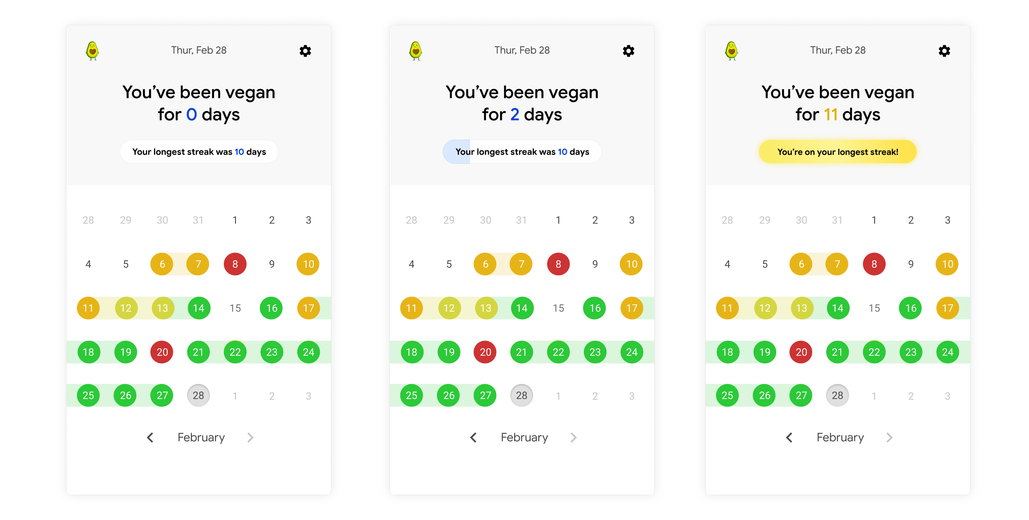
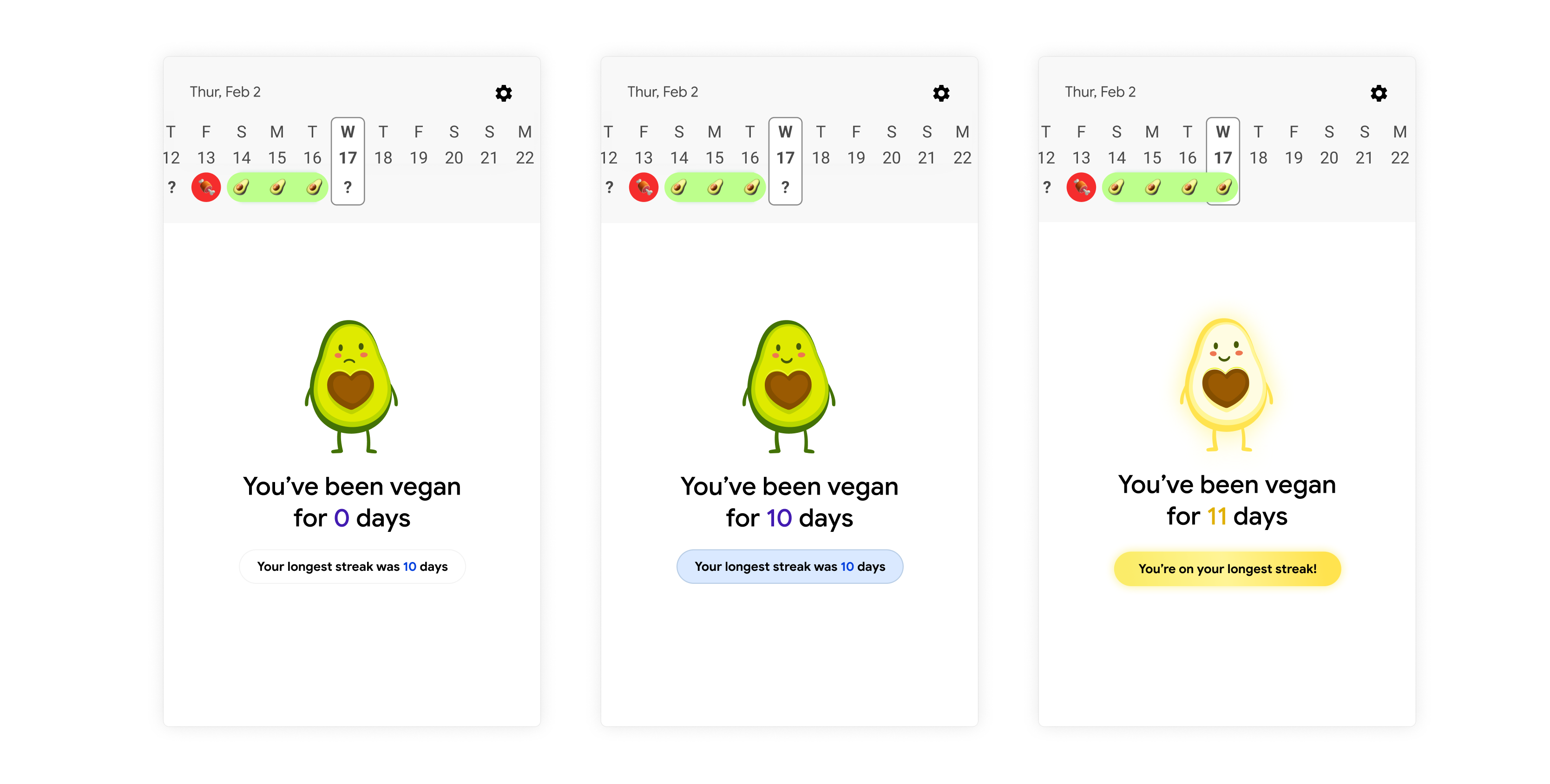
Then, to gamify things a little bit, let’s add a bar that fills up as the user gets closer to their ‘longest streak’. When the user is on their longest streak, it can light up gold, adding that extra bit of delight that I was trying to achieve with the little characters.
The different stages of a streak.
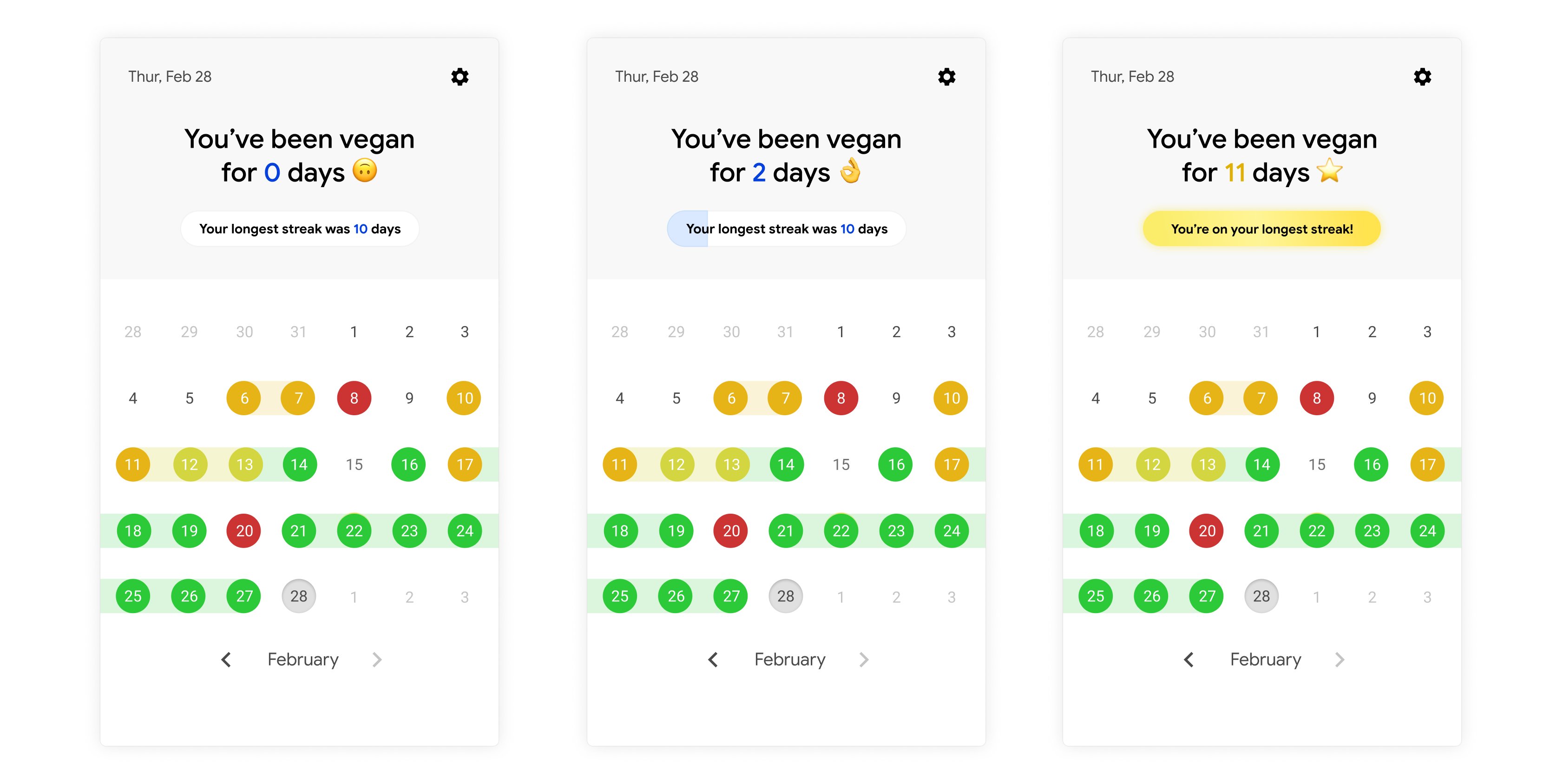
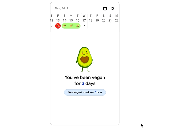
Next, I’m going to introduce emojis to add a bit more character to the interface. Emojis can be cheat-codes for interfaces — they can convey a huge amount of information and emotion in very little space, and their meanings are almost universally understood. And better yet, they’re free to use. Using them does run the risk of making your interface samey or derivative, but creating a strong visual identity isn’t a primary objective for me at this point.
Let’s remove the logo too — it’s just adding unnecessary visual clutter here. The user chose to open your app, so you don’t need to remind them where they are.
Finally, let’s look at the calendar. For some reason I had marked egg days with yellow and dairy days with orange. Wasn’t the point of this to show that a vegetarian day wasn’t necessarily a failure? Let’s go back to the original shades of green that I had in my spreadsheet, leaving only a meat day to be red and thus categorised as a failure.
Using colour to convey meaning isn’t accessible design, and my solution to this originally was to create a colourblind mode, which, whilst thoughtful, is not how I would tackle this nowadays. Accessibility shouldn’t be an optional extra. I want to make sure that my designs are accessible by default, even if it’s harder to do. So let’s add the little emojis used on the diet logging screen to each logged day.
It makes the interface more visually busy but solves the problem. A worthy trade-off.
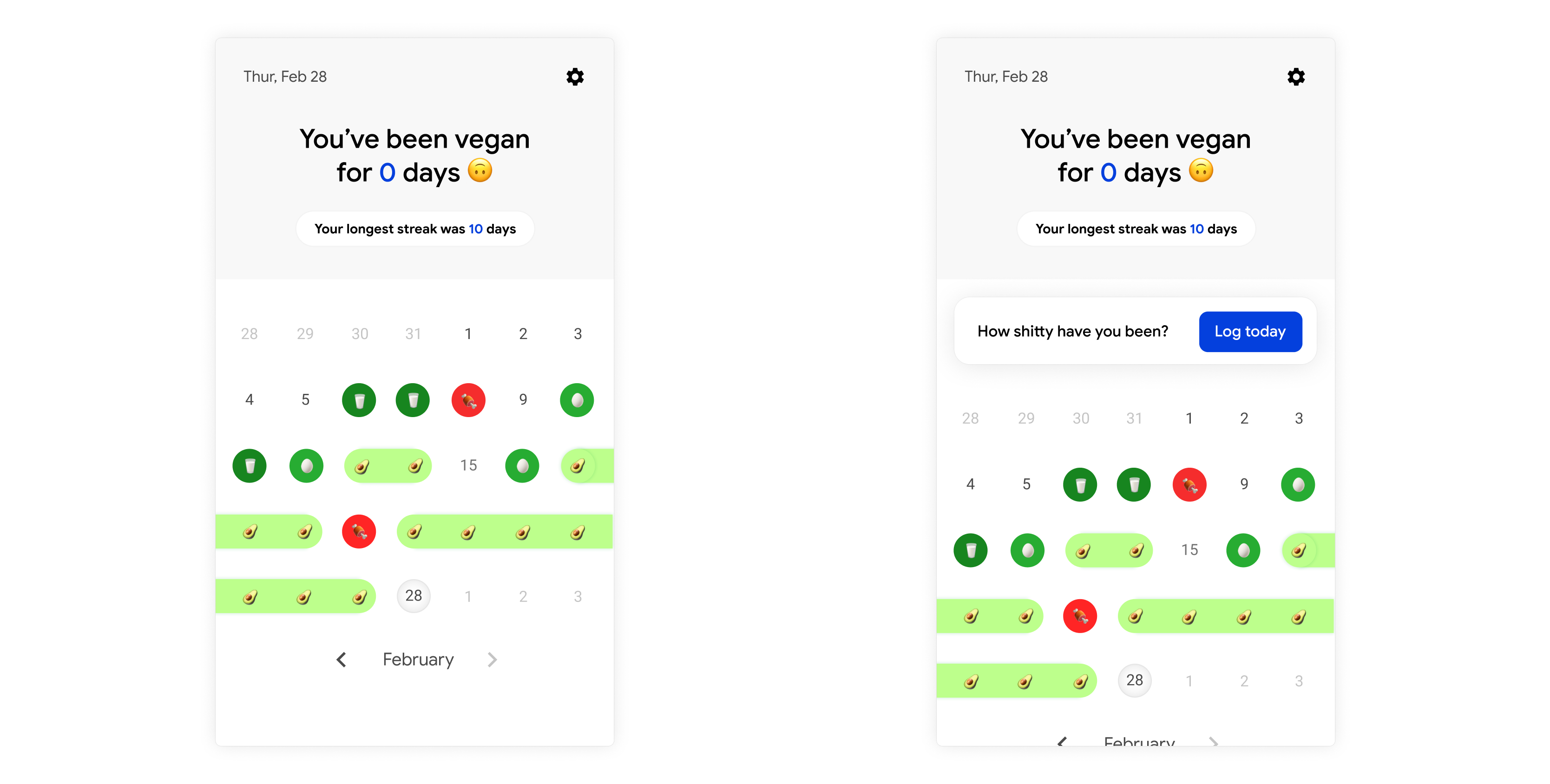
I’ll also add a little prompt that can appear towards the end of the day for the user, reminding them to log their diet:
The home screen, with and without the diet log prompt.
And with that, I think Current Jared is happy.
Before, the interface felt conceptually jumbled: a mix of concepts overlapping with no hierarchy or focus. Now, whilst the interface technically does less, each element on the screen is deliberate and the experience is consistent. At a glance, the user should hopefully be able to work out what the app can help them do (although I would need to run tests to prove this assumption). I think that the choice to emphasise the streak element not only supports the original calendar functionality but adds more delight to it, rather than detracting from it.
Unfortunately, there’s no way of knowing right now whether the solution that this app provides is actually something that would be helpful to users. But at the very least, with these few small tweaks (and hardly any changes to the visual identity) this redesign should help maximise success in testing the core assumptions, and will hopefully provide genuine value to users.
Having fun with it
For designers, just like everyone else, there is a constant battle between the left and right hand sides of the brain. The left, cold and calculated, aims for maximum practicality, feasibility, and viability. The right side wants to beautify, innovate, and create maximum delight for users.
I’m not sure whether you noticed, but I really stripped the interface down to its bare basics. No complex animations or interactions, no custom illustrations, no superfluous features. And whilst I maintain that this was the best decision in this case, experimenting with design is fun. So, pragmatic design aside, I allowed myself to play around with some more interesting interactions and animations whilst redesigning Shitty Vegan.
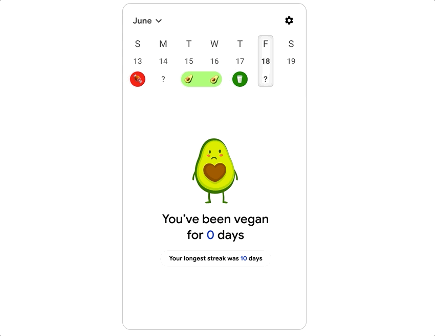
One big annoyance I had was the calendar, which had to be featured since it was so central to the core idea, and yet is a big, bulky element that cries out for progressive disclosure. So I played around with implementing it as one single row, flowing off-screen:
Minimising the calendar adds space above the fold for more interesting illustrations.
Whilst I felt this wasn’t a great solution since it didn’t give the user a full view of their month’s eating habits, I did make an animation of how it might work (high-res video version can be viewed here):
(Thanks to @alexprime on Figma Community for the loading animation.)
Okay, so how about progressive disclosure? Is there a way to unclutter the main screen whilst still allowing users to view month-by-month? Here was my solution (and high res version available again here):
What do you think? Does my redesign achieve what it set out to? How would you design Shitty Vegan?
Thanks for reading! If you’re interested in product design and UX, remember to follow me on Medium and Twitter (@jamchiller) for more content.